스와이프 제스처 기반 카드 컨트롤 오픈소스 - TinderSimpleSwipeCards
| 첨부 '10' |
|---|
TinderSimpleSwipeCards
This is for maximum customizability and / or learning purposes, not a pod or drop-in solution
The basics of a Tinder-like swipeable cards interface influenced by http://guti.in/articles/creating-tinder-like-animations/
This is meant to be taken and built off of, not as a simple drag and drop solution. New developers are often forced to use dependencies they don't understand and can't customize. This is the opposite. I've fully explained exactly how this works in detailed comments so that you can take it apart and customize it at will. For a pod/drag and drop solution, seehttps://github.com/modocache/MDCSwipeToChoose
Updates, Questions, and Requests
twitter <--- I am a very light twitterer, so I wont spam you
Relevant Article for deciding how to implement swipe cards into your app
https://medium.com/@cwRichardKim/adding-tinder-esque-cards-to-your-iphone-app-4047967303d1
On top of your current View Controllers
Features:
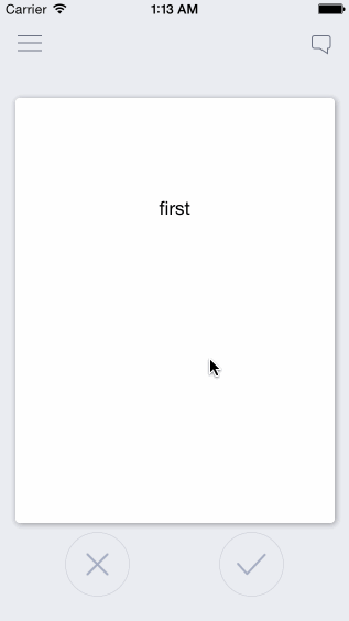
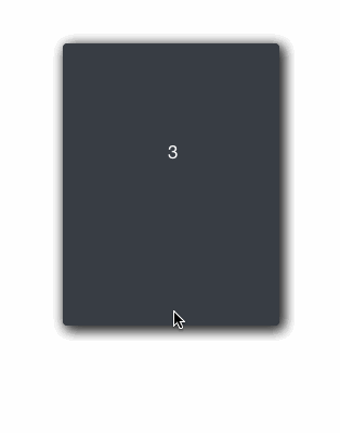
- Swipe cards left or right to call two separate actions
- Have multiple cards on screen depending on the number of items in an array
- Extremely simple, every component is explained
- Very easily customizeable
Customizeability Examples:
action margin (the distance from the middle required for an action to take place)
squeeze ratio (limit, strength)
rotation (strength, limit, angle)
+ More!
in DraggableView.h
- ACTION_MARGIN: distance from center where the action applies. Higher = swipe further in order for the action to be called
- SCALE_STRENGTH: how quickly the card shrinks. Higher = slower shrinking
- SCALE_MAX: upper bar for how much the card shrinks. Higher = shrinks less
- ROTATION_MAX: the maximum rotation allowed in radians. Higher = card can keep rotating longer
- ROTATION_STRENGTH: strength of rotation. Higher = weaker rotation
- ROTATION_ANGLE: Higher = stronger rotation angle
Each component is also explained thoroughly, so it is highly customizeable in many ways
How to use
files
- ViewController.h/m: example view controller (not necessary)
- DraggableViewBackground.h/m: UIView that holds the DraggableView. This can be put ontop of view controllers or you can set it as the main view of your view controller
- DraggableView.h/m: UIView of the draggable cards
- OverlayView.h/m: UIView of the X and √ images
Setup as View Controller (see ViewController.m)
  DraggableViewBackground *draggableBackground = [[DraggableViewBackground alloc]initWithFrame:self.view.frame];
  [self.view addSubview:draggableBackground];
Setup as UIView ontop of View Controller
  CGRect frame = self.view.frame;
  frame.origin.y = -self.view.frame.size.height; //optional: if you want the view to drop down
  DraggableViewBackground *draggableBackground = [[DraggableViewBackground alloc]initWithFrame:frame];
  draggableBackground.alpha = 0; //optional: if you want the view to fade in

  [self.view addSubview:draggableBackground];

    //optional: animate down and in
  [UIView animateWithDuration:0.5 animations:^{
      draggableBackground.center = self.view.center;
      draggableBackground.alpha = 1;
  }];
Presenting Your Data
Loading Data
- edit -(void)loadCards in DraggableViewBackground.m to dictate what information is loaded and how
- "allCards" holds all the cards you want to show, "loadedCards" only shows the first few so that it doesn't load everything at once.
if card data is loaded after initWithFrame, then make sure the data is included in your custom data array (currently "exampleCardLabels") at the index: yourIndex and then write the code:
DraggableView* newCard = [self createDraggableViewWithDataAtIndex:yourIndex];
[allCards addObject:newCard];
whenever you need to.
- I used exampleCardLabels as an example of how to load data, but feel free to change that
Presenting Data in View
- Customize the presentation of your data in -(DraggableView *)createDraggableViewWithDataAtIndex:(NSInteger)index in DraggableViewBackground.m (eg: make certain data appear on labels or photos in custom UIImageViews)
- to access any card directly, use [loadedCards objectAtIndex:yourIndex]; For example, the card that is currently visible is at [loadedCards firstObject];
Areas for Future Improvement / Involvement
- The repo potentially violates the MVC model by having to much controller functionality in a view (DraggableViewBackground)
- Improved naming (while maintaining legacy and / or easy directions for change)

| 번호 | 분류 | 제목 | 글쓴이 | 날짜 | 조회 수 |
|---|---|---|---|---|---|
| 36 | iOS |
커스텀 탭뷰 - JMTabView
|
hooni | 2014.03.18 | 234 |
| 35 | iOS |
커스텀 테이블뷰 - MGBox2
|
hooni | 2014.03.18 | 211 |
| 34 | iOS |
코드 미니맵 Xcode 플러그인 - SCXcodeMiniMap
|
hooni | 2014.03.18 | 209 |
| 33 | iOS |
코드를 보기좋게 재정렬 해주는 Xcode 플러그인 - XAlign
|
hooni | 2014.03.19 | 222 |
| 32 | iOS |
코믹북 필터링 적용 카메라앱 오픈소스, LiveCameraFiltering
|
hooni | 2015.07.20 | 735 |
| 31 | iOS |
코어 데이터 편집기 오픈 소스 - Core Data Editor
|
hooni | 2014.10.06 | 315 |
| 30 | iOS |
코어데이타에 iCloud 적용하는 간단한 샘플예제 Staff Manager
|
hooni | 2014.03.18 | 289 |
| 29 | iOS |
클래스의 상속관계를 도표로 그려주는 Xcode 플러그인, ObjectGraph
|
hooni | 2015.07.20 | 380 |
| 28 | iOS |
테이블뷰를 대체 가능한 커스텀 라이브러리 - MGBox
|
hooni | 2014.03.18 | 218 |
| 27 | iOS |
텍스트 자동완성기능이 추가된 UITextField - HTAutocompleteTextField
|
hooni | 2014.03.18 | 228 |
| 26 | iOS |
트리뷰형식의 테이블뷰 - SDNestedTable
|
hooni | 2014.03.18 | 235 |
| 25 | iOS |
트위터 동영상공유앱 Vine의 메뉴 구현하기 - REMenu
|
hooni | 2014.03.18 | 200 |